jQuery Mobile for Open Source Web Development
09.20.2012Mobile web usage is exploding. By 2015, 50% of all internet traffic in the US will come from mobile devices.[i] Building a mobile website has suddenly become a priority for many organizations. Frameworks like jQuery Mobile (jQM) provide a baseline of common mobile functionality that gets mobile sites completed faster and into the growing mobile marketplace.
First, let’s get some background on where this framework came from. jQM comes from the developers of the jQuery javascript library, which provides cross-browser compatibility and shortcut methods for common tasks. jQuery also has a great development community that pushes the library forward by taking advantage of its extensible architecture to write thousands of plugins for just about anything that’s not built into the core capabilities. This includes jQuery UI (user interface), which is the jQuery team’s repository for common page effects and elements like sortable lists, popup calendars for date fields, basic tabbed interfaces, and much more.
jQM is developed along the same lines and utilizes many of the advances of the other jQuery libraries. Like jQuery, jQM provides helper methods for common development tasks. It allows easy access to mobile touch events and orientation changes. It provides a framework to load new pages using asynchronous requests for faster content changes and to provide visual transitions like native iOS or Android apps.
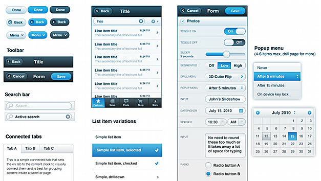
Like jQuery UI, jQM provides a visual framework to incorporate common design best practices from iOS and Android. This might seem like a secondary feature, but it can be a real time saver. Common app elements like persistent header and footer toolbars, larger buttons, on/off toggle switches, and even visually grouped lists are all part of the jQM default settings. From there, jQM provides theming tools to customize colors and other visual features to better match your brand goals. Even if further customization is needed, jQM provides a great base to start from.
As mentioned above with jQuery, jQM is also built to minimize cross-browser and cross-platform inconsistencies. Their top level support includes the default browsers for all versions of iOS, Android 2.1 and higher, Blackberry 6.0 and higher, Windows phone 7 and higher, Opera Mobile 11.5, and many more. That even includes modern desktop browsers. That means that even browsers with single digit percentages can use your site without experiencing any visual or functional differences beyond device hardware capabilities (processing speed, screen size, etc.). Particularly for new websites without any usage data, that’s a huge advantage over other frameworks that only provide advanced functionality in the latest Webkit browsers. A jQM site can reach the 10% or more of potential users who use non-Webkit browsers, like Opera Mini or Internet Explorer on Windows Phone.[ii]
Lastly, building with jQM still provides options for how you want to distribute your html-based experience. You can deploy it as a mobile website or you can package it using tools like PhoneGap or Appcelerator Titanium that can export it as an app to major phone platforms. With a mobile website, companies can maintain total control over their user’s experience, including feature updates . With packaging tools companies can reach most of the major platforms and, if the mobile experience needs additional features, can even access native device hardware and software like cameras, contacts, and notifications.
Those are just some of the currently important ways that jQM can help speed-up mobile website development. As with jQuery, there’s a great development community involved with jQuery Mobile. There are great developers pushing core jQM features ahead as best practices develop and others who are extending it with useful plugins. As it matures, jQM stands to provide a better and faster development experience.
DOOR3 jQuery Mobile Projects
-
DraftStreet
-
Padre Foundation
[i] Luke Wroblewski, Mobile First, Drupalcon 2012. Denver, CO. Keynote presentation.
[ii] Net Market Share. Mobile/Tablet Top Browser Share Trend. October 2011 to August 2012.