Responsive Design: Things to Keep in Mind
01.21.2016As growth in mobile commerce and content consumption increases, it has become imperative for businesses to have a mobile strategy in place in order to interact with their end users across all devices and platforms. If applicable, having both a native app and a mobile-friendly site is what consumers expect these days. But if building an app doesn’t make sense for your business, building a “responsive” website is the obvious way to go.
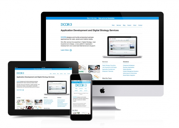
Responsive web design (RWD) is a term coined by Ethan Marcotte in a 2010 article in A List Apart. RWD gives users a seamless web experience across different screen sizes. By using fluid grids, flexible images, and CSS3 media queries among other tools, responsive web design seeks to minimize the amount of scrolling, zooming, and overall effort required on the part of the user in order to provide a more adaptive, faster web experience across different screen sizes and platforms. The concept seems to be intuitive, but the planning and execution require forethought.
Here are some things to keep in mind when you opt for responsive web design:
Think Mobile (& Content) First
In UX (user experience) design, thinking “mobile first” is an approach that many designers adopt when planning for a responsive site. Content that mobile users are most likely to seek should be identified and given appropriate hierarchical placement. Mobile first thinking also considers how the layout of things will change according to the viewport orientations of various devices, as well as screen resolutions. There are variations in content priorities for the mobile, tablet and desktop experiences, since all of these come with specific user scenarios that are attached to each, but starting with the smallest screen first is a common foundation to build upon. No matter what device, it’s paramount to keep navigation to key content and services clear and unfettered.
The goal of thinking mobile first is to ask and provide design solutions to the question, “What can be done to make this mobile user experience as seamless as possible?” To answer this, consider the amount of action that is required of the user to perform a specific task, and try to boil it down to the absolute essentials, taking into account the (among other factors) screen size, internet connection, and main purpose of the site. This goes hand in hand with aiming to minimize the site’s loading time by reducing requests and file size on the development side.
Stay Flexible
Responsive web design calls for images and videos that scale according to the screen size and pixel density – flexible media. There are JavaScript, HTML5, and CSS solutions to how to make images perform in a "responsive" manner on the web without too much page-load time, but a universally accepted way to load only the media that's actually needed for a specific device seems to be on the horizon.
Test It Out
Before you launch your website, make sure to test it on all major devices such as iPhone, Android, iPad, etc. and browsers such as Chrome, Safari, Internet Explorer, Firefox, etc. Although this seems tedious, it’s a very important step because every device and/or browser will display your website differently. Emulators can be a great help, but there’s nothing like testing on the actual device/browser. When available and/or applicable, beta testing on users will undoubtedly provide valuable feedback.
Responsive web design creates the opportunity for you and your business to interact with visitors with more versatility and provide an altogether more seamless user experience.