Responsive Web Design - The Universal Resolution
11.21.2011Imagine having a jigsaw puzzle that adapts to any surface you set it on, from a humble coffee table to a grand marble dining table. This, in essence, is what responsive web design is all about. The multitude of new device platforms and respective resolutions give us the opportunity to reach our target web visitors and potential clients in many different places; we are no longer constrained to the screen at the office or to wired Internet connections. Having so many options gives us the ability to reach anyone, anywhere and at any time. However, these options can also complicate the work of a designer who historically has only had to design for one or a very limited number of platforms.
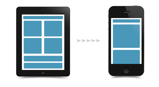
In Alex Castillo’s last blog, he defined responsive web design as a technique that utilizes Media Queries, CSS3, fluid layouts and flexible images to show the same content in the same way on many different screen resolutions. This article seeks to shed a light on responsive web design from the designer’s point of view and how to best use this technique to provide a uniform, user friendly experience for visitors to your site regardless of their choice of device.
One Resolution: An Antiquated Mindset
Screen resolutions are among us and the “one-size-fits-all” frame of mind only remains valid for baseball caps and pajama jumpsuits featuring Glaser’s I love NY logo. There are a multitude of new devices coming out every month and the number of different screen-resolutions have increased at a steady pace. To add to the growth, consider that the average user now interacts with 2 or more different devices on a daily basis. For example, I may use a smart-phone, a tablet, an over-sized desktop computer and a laptop in one typical day at the DOOR3 office, all with different resolutions.
One of the most important issues that needs to solved before engaging in a web project is to define the resolution that you’ll be designing to. As designers, we have tried to look for answers in analytics and stats, in charts that show traffic to our sites and in which resolutions users viewed our site. We are bound to analyze and classify, to pinpoint the ideal resolution for any given project, and we love market segmentation and persona creation for good reason. Simply put, we need to know where we’re going.
Designing for Multiple Platforms
Traditionalists will ask you to assign separate budgets to enterprise design systems and development for each platform, say separate versions for desktop, tablets and smartphones. While this approach does have its advantages, it also means that the cost of development will increase exponentially. Given the sheer volume of devices in existence, you may end up paying for 4-5 different projects from the ground up.
I recommend a different approach: Keep your developing costs low and embrace smart user experience and design. Using this method takes into consideration a wide range of resolutions and provides users with a seamless experience wherever they may be. This in turn can translate into a greater number of impressions and conversions on your web site, thus improving your business.
By using Responsive Web Design you can cut about 70% of developing costs per version. While some might argue that Responsive Web Design is not supported in older browsers, which was historically accurate, utilizing modern technologies such as Java Script and Media Queries allows us to bypass this issue for all browsers.
Piecing the Puzzle Together
Responsive Web Design is a smart way to keep your website efficient and effective in a world of countless screen resolutions. To make a website that adapts to all resolutions you will need the expertise of a user experience and design team to consider how content will render on a variety of different screens. Developers will then do their magic and depending on the end-users’ platform, the system will adapt the design by means of fluid layouts, CSS3 and Media Queries. Utilizing this method conserves the business’s valuable resources (i.e. money) without sacrificing usability, aesthetics and, equally important, without excommunicating users in the process. In other words, responsive web design is really the best currently available solution for developers, designers and clients alike.
To see a good example of responsive web design please see http://foodsense.is/ which contains a set of controls that allow users to change the width of the browser window and see how the design adapts to different resolutions. If you're accesing the site on a tablet device or phone, rest assured there is another layout for you.