2023 UI Design Trends: What's Hip and Rad in the World of UI
09.09.2021When we think about the idea of design trends, maybe we remember the iconic atomic era of the 1950’s. A prime example of an American design trend, where everything was either covered in flower and fruit printed fabric or looked like the cockpit of a complicated commercial aircraft, an homage to what the “future” of design would bring. Obviously a lot has changed with ever-evolving UI design trends, and now we find designs to be simpler and more accessible. These trends guide the user through complex tasks while giving them a soothing experience through a great interface.
A designer's visual choices allow users to understand the context of the element’s function and form a relationship with said element. Staying up to date with the latest UI design trends is crucial for a practicing designer, as trends challenge people to think outside the box and search for new ways to impress users with intuitive experiences.
Here are some of the latest UI trends appearing in the market, and how the DOOR3 design team feels about them.
6 UI Design Trends You Need to Know
1. Neumorphism
Neumorphism is a portmanteau of "new" and "skeuomorphism" to create a new visual design language. While skeuomorphism aims to make UIs look as accurate to real-world objects as possible, the focus of neumorphism is all on the color palette.
In the early days of software, everyone tried to make design elements look like common objects. This obsession with making everything look like its real world counterparts is known as skeuomorphism, and can be seen everywhere from the shutter sound of a digital camera to the recycling bin icon on your desktop.
The introduction of iOS helped designers take several large steps away from an interaction rooted in reality. iOS opened the door for designs to be more fluid between other devices, generalizing the idea of looking at things independently. As products are more infused with connectivity and real-world products, screen-based products look more like independent objects.
We are now comfortable with making software without always falling back on metaphors derived from the real world. As if the language of software is no longer complicated. In earlier days, it was always expected that enterprise software had to resemble a complicated system, with Neumorphism this is no longer the case.
Pros:
-
Looks trendy.
-
Looks friendly.
-
Offers design simplicity.
Cons:
-
Low contrast can be challenging for color blind viewers.
-
Button states are hard to differentiate.
-
Challenging to program.
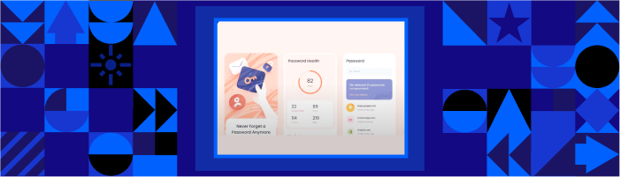
2. Illustrations and Abstract Texture
Bucking the previous trends of minimalism, custom illustrations are starting to make their way into UI design trends.
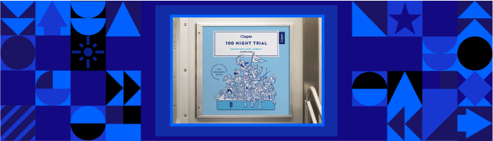
Clean broad field illustrations were in trend several years back, and they used a lot of different elements that were partially interacting with each other. A perfect example of such designs are the Casper Mattress illustrations all over the subway a few years ago.
But now, with these new UI design trends, we have UI/UX design patterns which look like they were drawn with ink, these patterns are referred to as abstract textures.
This is more of an aesthetic trend. The splatter of ink adds a little grit and realism to the design. It complements the warm colors and makes everything look more stylized.
Pros:
-
Adds brand personality to the product.
-
It can be animated to add more interest.
-
It helps differentiate your product.
Cons:
-
It can take up valuable real estate for a complicated product or feature.
-
It can distract users who are trying to complete an action.
-
It serves no function other than aesthetics.
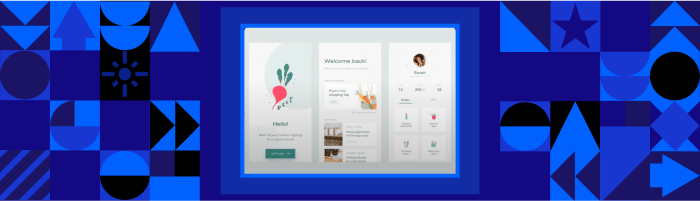
3. Softer, Warmer Colors
Warmer, less saturated colors are making their way back into current UI design trends, as soft colours help the product look more approachable.
That said, the same sort of consumer-to-professional migration of style sensibility happened in other earlier generations. Here the most prominent example was the move away from busy dashboards to more iPad-like interfaces. At that point these dashboards still contained the cool blues and all the hallmarks of corporatism in B2B applications or internal operational software, this trend bucked that standard palette.
There were a lot of conversations about the fact that corporate users working nine to fives spent the rest of their time on their couches at home with their iPad. So, their expectations were set by the commercial B2C trends regarding software.
We know corporations are generally not the early adopters of consumer sentiment or sensibility. But if there is an option to remove harsher elements and present a softer environment in which employees can get work done and focus their eyes where they need to, it’s to the benefit of the corporation to implement said option. It is something that also makes its way into corporate software quite easily.
Warm & soft colors also advocate and complement breathing space. This goes back thousands of years in the evolution of physical architecture. If you look at paintings from older times, you’ll notice that there was a lot of space. The scale difference between the humans and the space around them, between physical objects and buildings, was enormous.
We’ve made more and more compromises as we get squeezed into less and less space. With our modern digital landscape, we can go back to what is actually more comfortable for humans, which is to have breathing room.
Pros:
- Look more friendly.
Cons:
- Using soft tints can be tough on color blind users.
4. Friendly Copy
A friendly or micro copy is intended to be more conversational and directed at the user more casually. But finding the right type of puns and jokes that make people chuckle or laugh is a tricky process.
The best way to create a well executed example of friendly copy is to focus on your target audience. If you can characterize your audience and somehow fit your microcopy into categories that align with language and sensibility boundaries, you will be in an excellent position to appeal to your target market.
Otherwise, you have to edit your humorous blurbs with precision and intention to make sure your friendly copy is not off putting. This kind of copy requires a lot of thought, to consider what feels like friendly copy to your audience not only today, but what language will have the same kind of impact in a few years as well.
Pros:
-
It adds brand personality.
-
It can make the user feel more connected to the app.
Cons:
- It may confuse the viewers if the accepted language isn’t used for interactions or tasks.
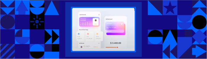
5. Glassmorphism
Related to neumorphism, glassmorphism is a portmanteau of "glass" and "skeuomorphism". It represents depth through transparency, blur effects, shadows, and layering of images or illustrations. Though seen as just an aesthetic trend, if looked at from a different lens, it becomes more substantive and less of a trend in models.
Back in the day, models would lock up the entire OS for an application. Now we see a lot more elegance in the user interface design of models, thanks to the implementation of transparencies. Everything becomes much more context-sensitive with transparency. Slight translucency maintains some degree of continuity when used in a model or pseudo-model form because it gives users just a tiny hint of what they left behind on the previous screen.
Through such small yet impactful work, UI/UX designers are more successfully converging on a new language or vocabulary for building virtual space, less bound by our inhabited feelings of actual space.
Pros:
-
Looks trendy.
-
Apple has adopted it in Big Sur.
-
Microsoft’s fluent design system uses it.
Cons:
-
It can cause accessibility issues if contrast is too low between the background, glass and text.
-
It can look busy.
6. Animation
Adding motion to a UI is a great way to add emphasis, interest, and interactivity to a product. It can be a powerful UI/UX tool for enhancing the UI of a product. When used appropriately, animation can help communicate information and provide a more enjoyable and engaging experience.
It can draw the user's attention to important elements on the screen, show how something works or demonstrate a process, and make the interface more dynamic and alive.
Animation can also add a touch of whimsy or personality to the design, making the user experience more enjoyable. These techniques can be especially useful when there is a lot of information displayed on the screen or when the product is complex, helping to make the interface more intuitive and easier to use.
Pros:
-
Looks trendy.
-
It can add emphasis to an action to improve the UX of a complicated process.
-
It makes the product feel more alive.
Cons:
-
It can become a distraction if overused.
-
Challenging to program.
-
It can affect load times and functionality.
DOOR3 Predicts What the New UI Design Trends Will Be
Here are the predictions of new UI design trends by DOOR3’s UI team:
1. Voice
Voice-based UI is becoming an increasingly popular trend in the field of design. With the proliferation of smart speakers and other voice-enabled devices, more and more people are using voice commands to interact with technology. As a result, designers are starting to consider the role that voice can play in the user experience.
2. Haptic Design
Haptic design, also known as touch or tactile design, is a UI design trend focusing on the sense of touch. Haptic design can include the use of vibrations, pressure, and other physical sensations to provide feedback to the user and enhance the overall user experience.
The advantage of the haptic design is that it can make a user interface more intuitive and easier to use. When haptic feedback is integrated with visual and auditory cues, it can help to confirm that an action has been completed and provide the user with a sense of satisfaction. Haptic design can also be particularly useful for users with visual impairments, as it can provide additional information and context through touch.
3. Biometrics
Biological characteristics, such as fingerprints, facial features, or voice patterns, are used in biometrics to identify or authenticate individuals. In the field of UI design, biometrics are being explored as a way to improve security and convenience for users.
If you think about your iPhone, it can unlock itself using your face as the key. That’s an incredible evolution in using our biology as a tool for user design. Now, virtually all the apps on an iPhone can participate in the facial recognition provided by the operating system. We think biometrics will continue to spread widely and be used in many different scopes.
UX Trends in 2023
Think there are some other design trends that we overlooked? Let us know, send us a message with your favorite UI/UX trends.